When working with text in Adobe Photoshop, you may want to adjust the spacing between your letters to make them either tighter or looser.
By adjusting the horizontal spacing (called tracking) between the lettering in your text, you can improve the readability of your text, or make it more visually aesthetic.
A great example of this would be a bold heading on a flyer or social media graphic where you want the letters to spread further apart for both looks and readability.
Table of Contents
Here's how to do it
- Open your Photoshop project file
- Select or create the text you want to adjust the space of
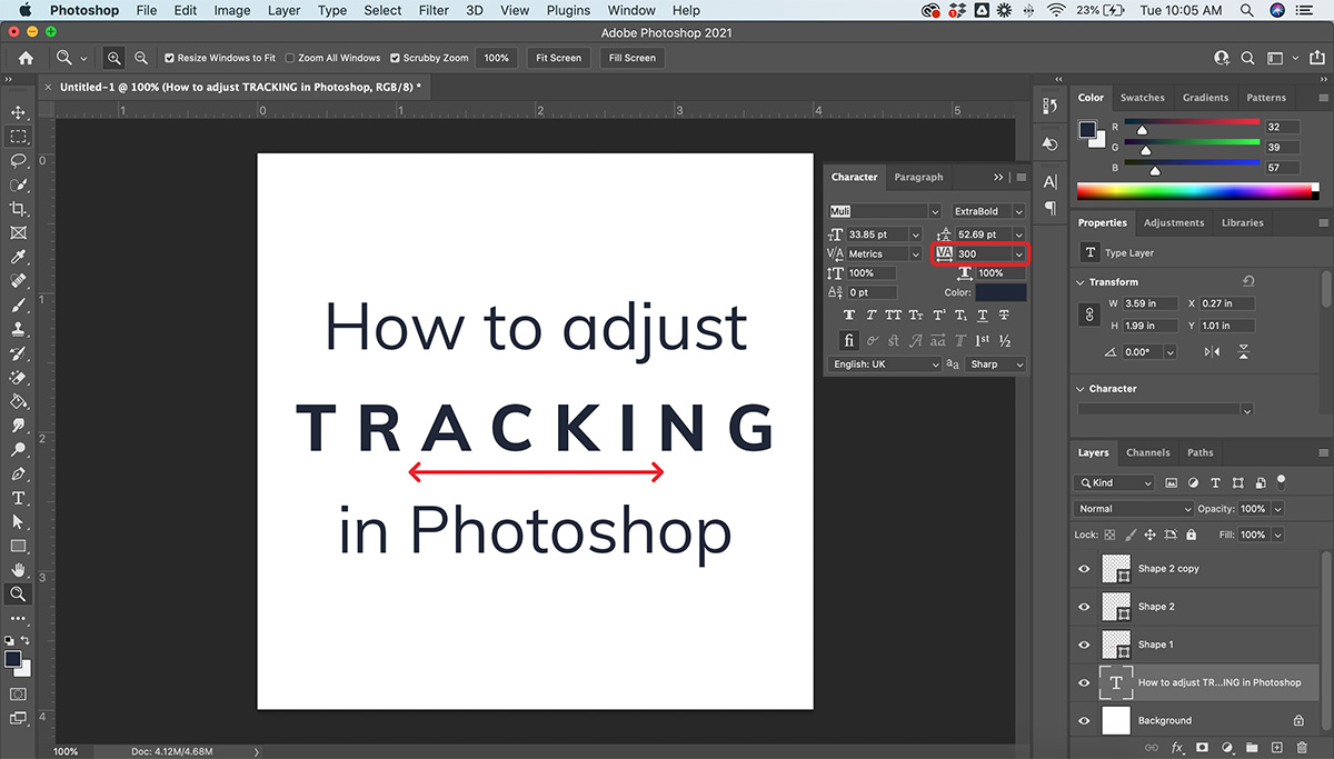
- Open the Character Panel (Window > Character)
- Adjust the spacing of your text by changing the point value in the tracking box (the "VA" icon) — the higher the value, the more the spacing
What is Tracking?
Tracking is a term used to describe the space between letters in a line of text. Tracking affects the space between both the individual letters as well as the spacing between whole words.

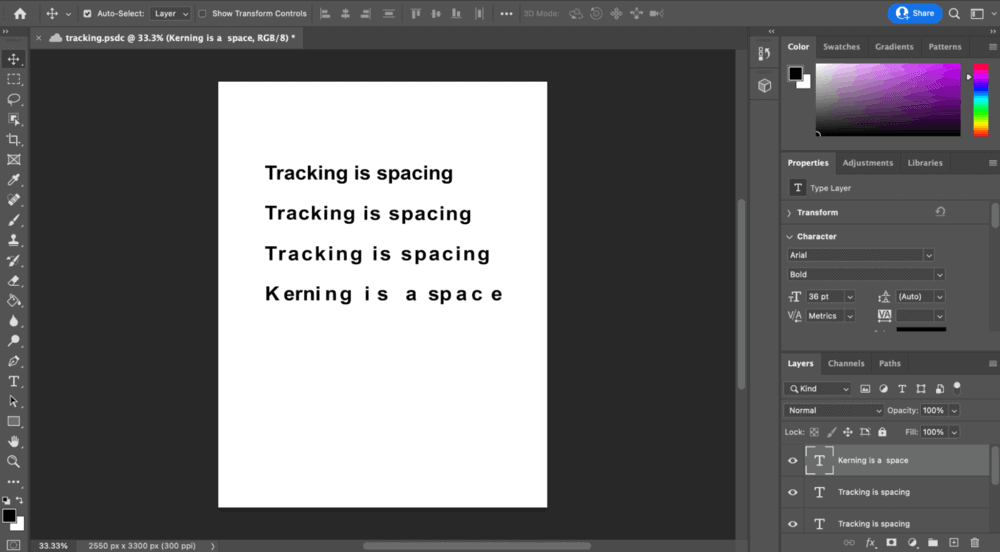
As shown in the above image, when you increase the distance between letters the total length of the word and sentence increases as well.
Pro-tip: When designing graphics in Photoshop, utilizing different tracking values in the same project can make your graphic more dynamic and entertaining.
How to use Tracking
It is necessary to use tracking when creating headlines and paragraphs in Photoshop.
For headlines
- Highlight your written headline by Double Clicking or selecting the Type Tool (T)
- Manually enter a value into the Tracking Box (VA icon)
- Alternatively, click the Down Arrow next to the Tracking Box and increase spacing by increments of 10
For paragraphs/body text
- Select the body text by Double Clicking or selecting the Type Tool (T)
- Manually or incrementally adjust the value in the Tracking Box (VA icon)
Streamlined Method
If you want a streamlined process to adjust the tracking of your text visually, follow these shortcuts:
- Select the text you wish to adjust
- Hold Option
- Click the left and/or right Arrow Keys until you find the right spacing
Pro-tip: If you want to make more detailed adjustments using this shortcut method, Click Command + K, select Units & Increments, and lower the value to make more detailed Tracking adjustments.
Why do we use Tracking in Photoshop?
One of the main reasons we use Tracking in Photoshop is to improve the readability of text. Especially for bodies of text, a high volume of words in one location can quickly become too dense and hard to read. By increasing the spacing the text becomes more spaced out and easy to read.
Another reason we use Tracking is to improve the style of graphics and ads. For example, a flyer that will be printed needs to have adequate spacing between the letters both so it can be read from far away, as well as to look better stylistically.
It is important to always look at how different values of Tracking look in your project. Oftentimes the missing piece to make a project look more professional and polished is Tracking.
Tracking vs Kerning
Tracking is affecting the spacing between letters and words, Kerning is affecting the space between two letters exclusively.

Both Kerning and Tracking involve space. Kerning, however, is used mostly for large text and titles to adjust the space between individual letters.
How to Kern:
- Highlight the two letters you wish to adjust with the Type Tool (T)
- Hold Option
- Click the left and/or right Arrow Keys until you find the right spacing
If you want to learn more about the details of Tracking and Kerning, click here.
How to change or adjust Tracking
Tracking can be changed at any point during your project. If you are doing detailed adjustments to the spacing, it may be beneficial to reduce the tracking values. Alternatively, if you are working on a large-scale project and want to make more dramatic adjustments, you can increase the value making the spaces larger.

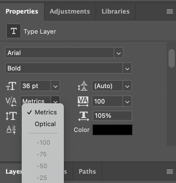
You can change Tracking to either Metric or Optic:
- Metrics is auto-tracking/kerning, fonts have preset spacing values that work best with their unique designs
- Optical is spacing based on the size of the letters and works best when using multiple fonts


