
To use auto layout in Figma, select the frame, group, or components that you want to apply auto layout and open the Design panel on the right side of the screen. Under the Auto Layout section, click on the plus sign icon to add a new auto layer for the selected objects.
A feature that makes Figma stand out is its ability to handle responsive design, which means adapting the layout and content of a UI to different screen sizes and devices. Auto layout is an essential feature for creating responsive designs in Figma, and here is why.
Table of Contents
What Is an Auto Layout in Figma?
Auto layout is a feature that allows you to create frames that automatically resize and reposition their children based on padding, spacing, and alignment settings. Auto layout is useful for making flexible layouts that adjust to the content and the container, such as buttons, cards, lists, or forms.
Auto layout can be applied to any frame, group, or component in Figma. You can also nest auto-layout frames within each other to create more complex layouts. Auto layout frames can have different properties, such as direction, alignment, distribution, gap, padding, and fill.
You can use auto layout in combination with other features, such as constraints, variants, plugins, and community files, to create more flexible and consistent UIs. By using these features, you can create UIs that are consistent, usable, and accessible across different devices and platforms.
How to Use Auto Layouts in Figma
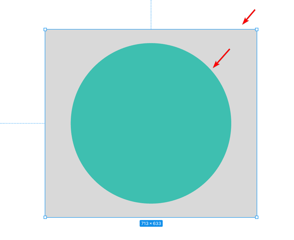
To use the auto layout in Figma, select the layers to which you want to apply it.
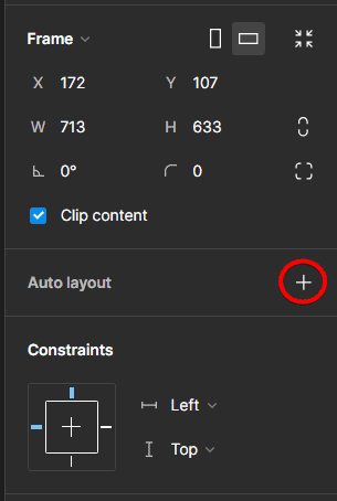
Under the Auto Layout section in the Design tab, click the plus sign next to Auto Layout to create a new layout for the selected layers. You need to select more than one layer or component for this to work.
Alternatively, use the keyboard shortcut Shift + A on Windows and Mac to turn the auto layout on or off for the selected layers.
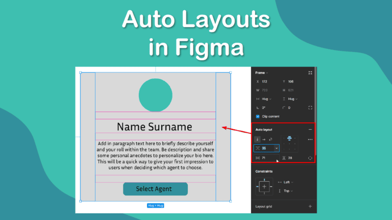
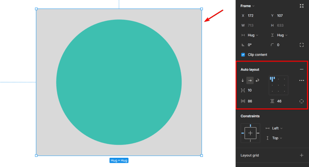
Once you enable auto layout, you will see a blue outline around the layer, indicating an auto layout frame. You will also see the auto layout properties in the Auto Layout section, where you can adjust the settings for the auto layout frame.
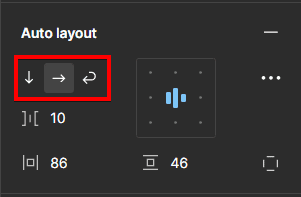
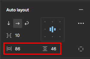
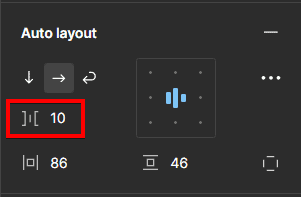
Once you have an active auto layout, you can adjust the various settings for the layout. The “Parent” has four properties you can adjust: Direction, Padding, Gap, and Alignment.
Direction: Let’s you set the design as a Vertical, Horizontal, or Wrapped layout
Padding: Sets the open space around the “children” objects within the “parent”
Gap: Determines the horizontal or vertical space between each object in the layout
Constraints: Set the constraints for the "children" objects by sticking them to a specific area within the “parent” object, even when the layout is resized.
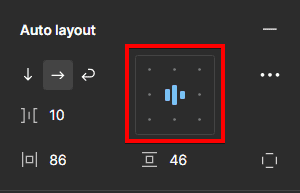
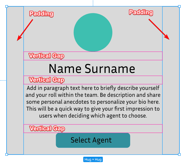
Here is an example showing the padding on the edges and the vertical gaps evenly distributing the elements.
Tips for Using Auto Layouts in Your Workflow
Auto layout is an essential feature for creating responsive designs in Figma, but it can also be tricky to use correctly. Here are some tips to help you use auto layout in your workflow:
Use auto layout for dynamic content: Auto layout is ideal for creating layouts that adjust to the content and the container, such as buttons, cards, lists, or forms.
You can use auto layout to create responsive components that adapt to different content and contexts, such as text, icons, images, or inputs. You can also use auto layout to create layouts that expand or collapse based on the content, such as accordions, menus, or modals.
Use constraints and variants for static content: Constraints and variants allow you to control the size and position of a layer relative to its parent frame, as well as its appearance and behavior.
Constraints define how a layer behaves when its parent frame is resized, while variants are different versions of the same component with different properties, such as size, color, or visibility.
You can use constraints and variants to create responsive elements that can have different appearances and behaviors based on different scenarios, such as hover, active, disabled, or selected. You can also use constraints and variants in combination with auto layout to create more complex layouts that respond to both the content and the container size.
Use plugins and community files for inspiration and guidance: Plugins and community files can help you create and test responsive designs in Figma.
Plugins add extra functionality to Figma, such as generating code, creating animations, or testing usability. Community files are files that are shared by other Figma users, such as templates, UI kits, or examples.
Auto layout is a feature that allows you to create frames that automatically resize and reposition their children based on padding, spacing, and alignment settings. Auto layout is useful for creating flexible layouts that adjust to the content and the container, such as buttons, cards, lists, or forms.