

Responsive design is the practice of designing websites or apps that adapt to different screen sizes and devices. Using variants, breakpoints, constraints, and auto layouts ensures that the user experience is consistent and optimal across various platforms and contexts.
In this article, I will walk you through some of the most important aspects of responsive design in Figma and how to apply them to your own projects.
Table of Contents
What Is Responsive Design?
Responsive design is a way of designing digital products that respond to the user’s device, screen size, orientation, and preferences. This style of design improves the user experience, as it ensures that the content and layout are appropriate and accessible for different scenarios and environments.
Responsive design also benefits developers and designers, as it reduces the need to create and maintain multiple versions of the same product for different devices. Ultimately, it is essential in the modern web, as the number and variety of devices and browsers are constantly increasing and evolving.
Creating Responsive Designs in Figma
Frames
The base of any design in Figma, including responsive designs, is frames, which are containers that define the boundaries and dimensions of your design elements. You can use frames to create different layouts and breakpoints for different devices and screen sizes.
Variants
Variants in Figma are a way of organizing and managing multiple versions of the same component in Figma. A component is a reusable UI element that can have its own properties, such as color, text, layout, and interactions. Variants allow you to group related components together and switch between them easily. For example, you can create variants for a button component that have different states, such as default, hover, pressed, disabled, etc.
To create variants, follow this quick guide: Variants in Figma
Variants are useful for creating responsive designs because they allow you to create and manage different versions of the same UI element that can adapt to different scenarios and contexts.
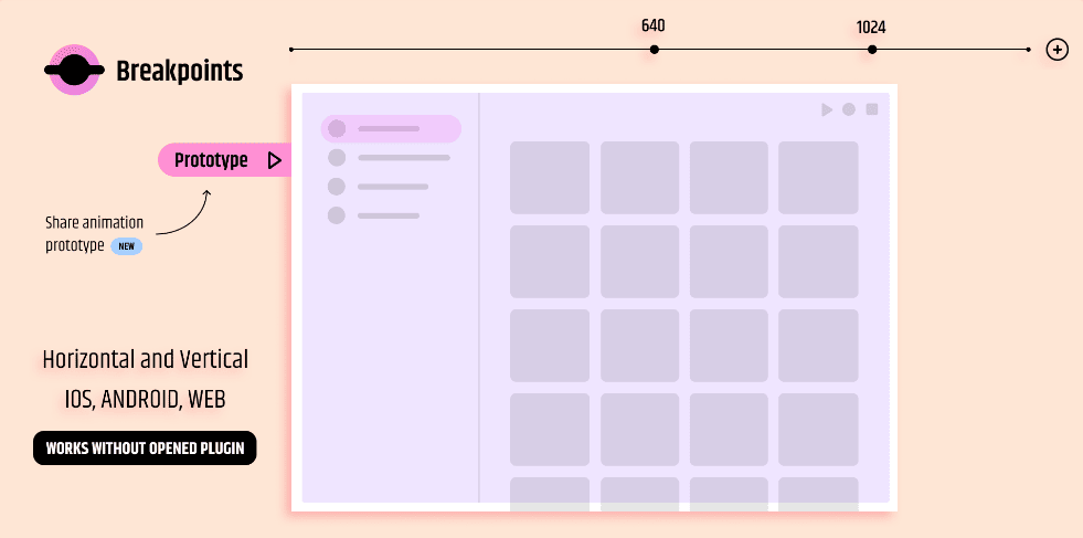
Breakpoints
Breakpoints in Figma are the points at which the layout of a website or app changes based on the screen size or device. For example, a breakpoint can be the point at which a website switches from a horizontal to a vertical layout or from a grid to a list layout.
To create breakpoints, follow this quick guide: Breakpoints in Figma
Breakpoints are essential for creating responsive designs because they allow you to develop and test different layouts for different screen sizes and devices.
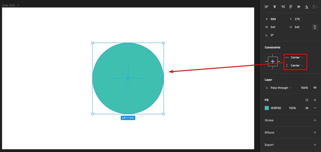
Constraints
Constraints in Figma are a way of defining how the UI elements within a frame resize and reposition when the frame size changes. Constraints help to create responsive designs that maintain the relative position and size of the UI elements regardless of the screen size or device. You should use constraints to help keep a logo centered, a button aligned to the right, or a text box filling the available space.
To add constraints, follow this quick guide: Constraints in Figma
Constraints are important for creating responsive designs because they allow you to create and maintain consistent, flexible layouts that are adaptable to different screen sizes and devices. For example, you can use constraints to create a header component that has a logo, a navigation menu, and a search bar that resizes and repositions appropriately for different screen sizes and devices.
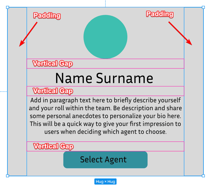
Auto Layout
Auto layout in Figma is a feature that automatically adjusts the size and position of the UI elements within a frame based on their content and spacing. Auto layout helps to create responsive designs that fit the content and avoid overlapping or cropping. For example, auto layout can help create a list of items with variable heights, a button with dynamic text, or a card with multiple elements.
To open Auto Layout, follow this quick guide: Auto Layout in Figma
Auto layout is useful for creating responsive designs because it allows you to create and manage dynamic and flexible layouts that fit the content and avoid overlapping or cropping. For example, use auto layout to create a form component that has input fields, labels, and buttons that resize and reposition based on the content and spacing.
Plugins and Community Designs
Plugins are extensions that add extra functionality and features to Figma. You can use plugins to enhance your responsive design workflow, such as generating responsive grids, testing your design on different devices, and exporting your design to code.
Breakpoints: This plugin is useful for adding and testing breakpoints in Figma for your responsive design.
Responsive Web Design in Figma: This design file is a useful starting point for creating your own responsive design in Figma. You can use the file as a template to learn responsive design elements and create your own website designs.
Other Responsive Design Elements to Consider
Typography
Typography is the technique of arranging text in a readable and appealing way. It is one of the most crucial aspects of responsive design, as it affects the readability, accessibility, and aesthetics of your product. Some of the best practices for responsive typography are:
- Use relative units, such as percentages, to define the font size, line height, and spacing of your text to make your text scale proportionally to the frame size
- Create a hierarchy and contrast between different levels of text by using headings, subheadings, body text, and captions
- Use a font that has multiple weights, styles, and variants to adapt to different contexts and moods
- Use a web-safe font, which is a font that is widely available and supported by most browsers and devices, to ensure that your text is rendered correctly and consistently across different platforms
Images
Images are visual representations of information, such as photos, illustrations, or graphs, and affect the performance, accessibility, and aesthetics of your product. Some of the best practices for responsive images are:
- Use vector images to create scalable and resolution-independent graphics, such as icons, logos, and diagrams. Vector images are resizable and can be manipulated without losing quality or clarity
- Use raster images to create realistic and detailed graphics, such as photos, textures, and gradients. Remember, raster images have a fixed resolution and size, which means that they can lose quality or clarity when resized or manipulated
- Use adaptive images to improve your product's performance and user experience, as they can reduce the loading time and bandwidth consumption of your pictures
- Use responsive images to improve the accessibility and aesthetics of your product, as they can ensure that the images are always visible and relevant to the user. You can use techniques such as constraints, auto layout, and masks to create responsive images in Figma
Buttons
Buttons are interactive elements that allow the user to perform an action, for instance, submitting a form, navigating to a page, or opening a menu. Buttons are one of the most common and essential elements of responsive design, affecting your product's usability, functionality, and feedback. Some of the best practices for responsive buttons are:
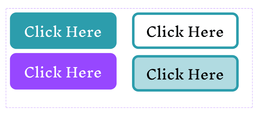
- Use clear and concise labels that are short, simple, and meaningful. Verbs work well to indicate the action, such as “Click Here,” “Submit,” and “See More”
- Use appropriate sizes that can be easily seen and tapped but not too large that they take up too much space. Generally, use a minimum size of 64 x 44 pixels for touch devices and a minimum size of 64 x 32 pixels for mouse devices
- Use consistent and contrasting colors that match the brand identity and contrast with the background and the text of the button
- Use distinctive and dynamic shapes to be easily recognized and differentiated from other elements and dynamic enough to indicate the state and feedback of the button
Navigation
Navigation is the system that allows the user to move around and explore your product, such as menus, tabs, and breadcrumbs. Navigation is one of the most challenging aspects of responsive design, affecting your website's discoverability, usability, and functionality.
Forms
Forms are interactive elements that allow the user to input and submit data, such as text fields, checkboxes, and radio buttons. Forms are one of the most complex aspects of responsive design, as they affect the functionality, accessibility, and security of your product. Some of the best practices for responsive forms are:
- Use clear and descriptive labels, which are the text that explains the purpose and format of the input field
- Use appropriate input types, which are the attributes that define the type and format of the data that the user can enter
- Use intuitive and consistent interactions, which are the behaviors and feedback that the user experiences when interacting with the form. Interactions should be intuitive and consistent with the user’s expectations and the platform’s conventions
- Use adaptive and flexible layouts to accommodate different screen sizes and orientations, such as using grids, columns, and rows to organize the form elements and using breakpoints and media queries to adjust the layout for different devices
Once you put everything together, you can create responsive designs that keep the design intact, even when resizing for various screens.

By using these features, you can create responsive designs that optimize the user experience and usability for different screen sizes and devices. Figma responsive design is a skill that can help you make better and more versatile user interfaces for your projects.