
To create variants in Figma, create your component, convert it to a variant using the Design tab, edit the properties and values in the Design tab, and then create more variants while changing the values each time.
While this may sound confusing, in this article, I will show you how to create variants in Figma, plus some extra tips when using variants.
Table of Contents
How to Create Variants in Figma
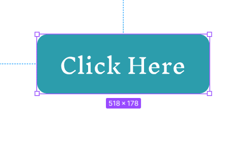
Before creating variants, you need to make your components. As usual, you can create your components using frames, shapes, text, and other layers. Remember, to create a component, add the element(s) to the page, then right-click and select Create Component.
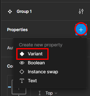
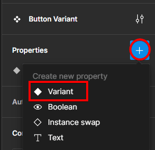
Then, to turn the component into a variant, add a property by clicking on the plus sign next to Properties in the Design tab and selecting Variant.
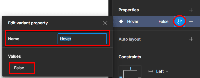
Next, click on the property settings icon and change the Variant’s name and value in the settings box.
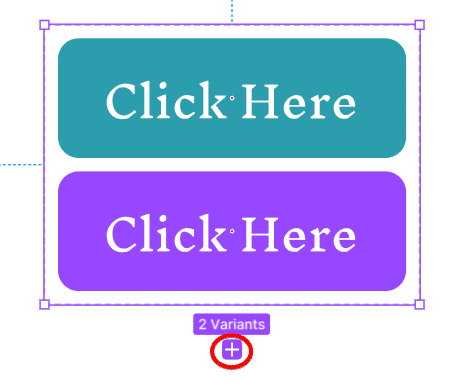
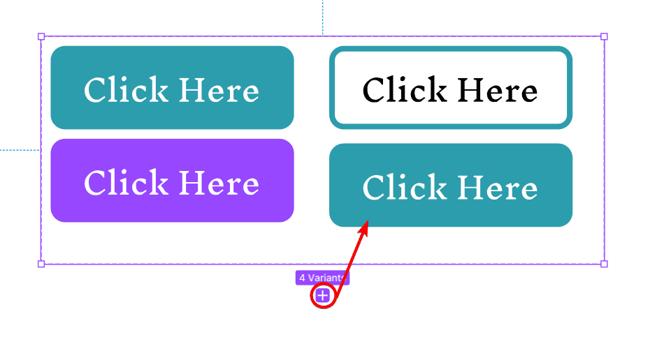
To create a new variant, click on the plus icon below the component on the page.
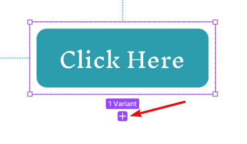
You will now have a new variant below the original.
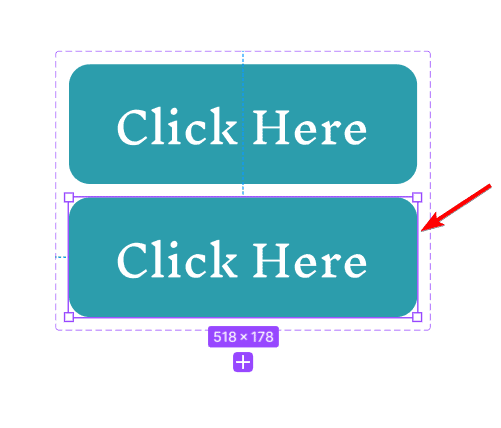
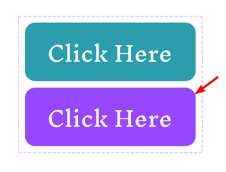
Change the look of the new variant by changing the color or size.
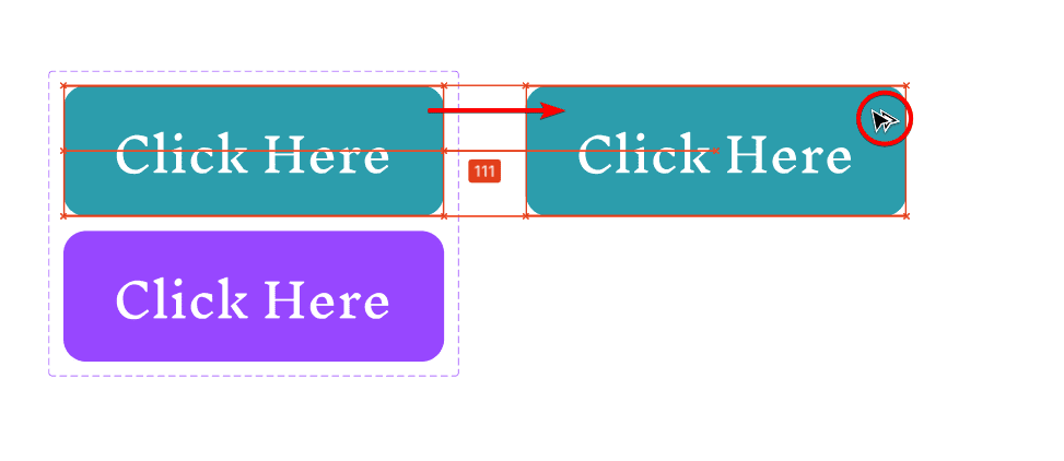
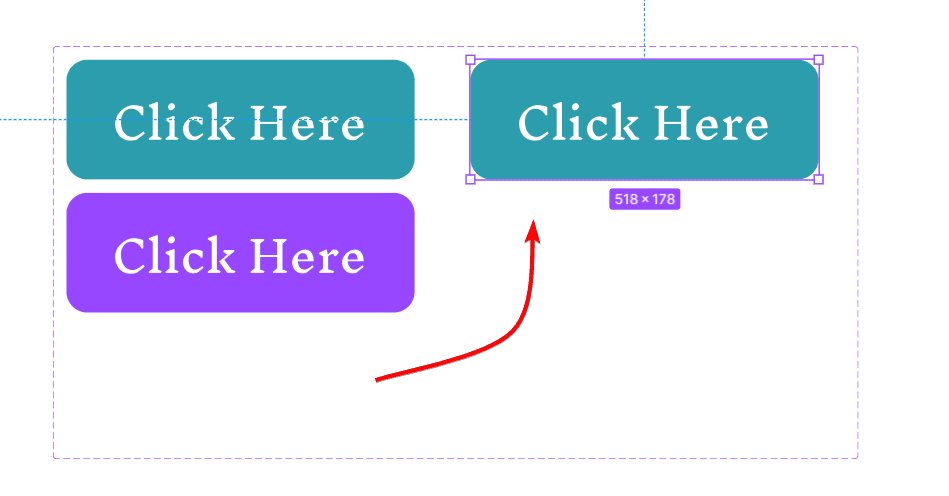
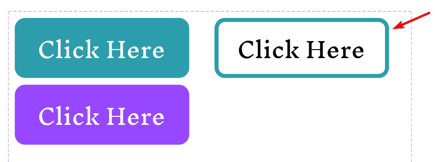
Now, to test this variant set, click on the first variant you created, hold Alt on Windows or Option on Mac, and drag it to make a duplicate.
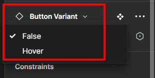
Now, in the Design tab, you will find a drop-down list you can use to switch between the two values you set, false and hover. If it's working, you can delete this test button and move on to create secondary variants.
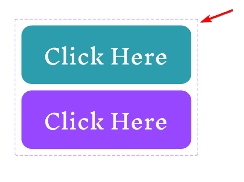
Before adding secondary variants, set the first variants as primary variants by clicking on the dotted purple boundary box around the buttons.
Then, click on the plus sign next to Property in the Design tab and select Variant.
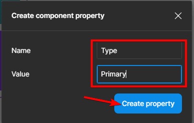
Set the Name to Type and the Value to Primary. Then click Create Property.
Now, you can move on to creating the secondary variants. To do this, ensure the boundary box is selected and click on the plus sign at the bottom to create a new variant.
You can move the new button into a new row for more clarity between the primary and secondary variants.
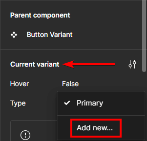
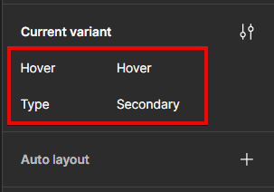
Now, after selecting the new variant, go to the Design tab, and under the Current variant section, click on the drop-down menu next to Primary and select Add New.
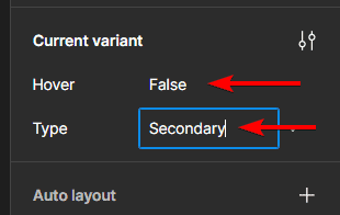
Then, change the Type to Secondary and ensure the Value is False.
You can now change the secondary button's color and/or size.
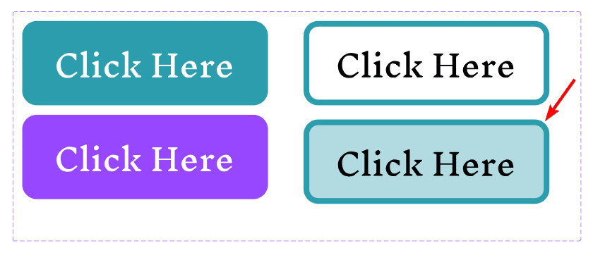
To change a different state for the secondary variant, click the plus icon to create a fourth variant in the boundary box.
Select the new variant by double-clicking on it, then change it to Hover and the Type to Secondary in the Design tab.
You can now change the color of the new variant in the secondary category. You will now have two sets of variants: a primary set and a secondary set.
Once you are happy with your variants, you can publish your component set to your team library so other designers can use it in their projects.
Tips for Using Variants in Figma
Use the slash naming system: The slash naming system is a way of creating a hierarchy and structure for your components by using slashes (/) to separate different levels of categories and subcategories. For example, you can name your components as:
- Button/Primary/Default
- Button/Primary/Hover
- Button/Secondary/Default
This will help you organize them in the asset panel and the instance menu.
Use descriptive and consistent names: You should use descriptive and consistent names for your properties and values to make them easy to understand and use. You should also avoid using ambiguous names. Use names that reflect the meaning and purpose of the variants, such as Primary, Secondary, Tertiary, Default, Hover, Pressed, and Disabled.
Add variant descriptions and icons: You can add variant descriptions to your component sets to make them more informative and recognizable. You can add a description to your component set by clicking on the Settings icon under the Current Variant section in the Design Tab and typing your text.
What Are Variants in Figma?
Variants are a type of component property specific to variants and component sets. A component set is a collection of components that share the same properties, such as state, size, color, layout, etc. For example, you might have a component set for buttons, with different variants for primary, secondary, and tertiary buttons, as well as different states (default, hover, pressed, disabled) and sizes (small, medium, large).
Each variant in a component set is a unique combination of properties and values. You can add as many properties and values as you need and customize them to suit your design system. You can even map your properties and values to code components in your design system, following the prop/value format, which is used in popular frontend frameworks like React and Vue.
Variants have many benefits for designing and maintaining scalable and consistent user interfaces. Some of them are:
- Easier component browsing: You no longer need to look through variations of the same component in the asset panel or wonder which one is the right one. You can simply select a component set and configure the properties and values in the design tab.
- Reduced complexity of instances: You can easily adjust properties without changing the entire component. You can also swap between variants using the quick actions menu.
- Preserved overrides: Nested components and style overrides are preserved when switching between variants. This means you can customize your instances without losing your changes when you change the variant.
- Compatibility with existing work: Variants will automatically replace any existing components that match the naming convention, so migration for existing files is easy.
Variants are a powerful feature of Figma that can help you create and use components more efficiently and effectively. Variants let you group and organize similar components into a single container and customize their properties and values to match your design system and code components.
Variants also make it easier to browse, configure, and customize the components in your designs and preserve your overrides when switching between variants. Variants also make it easier to migrate your existing components and maintain your component library.