
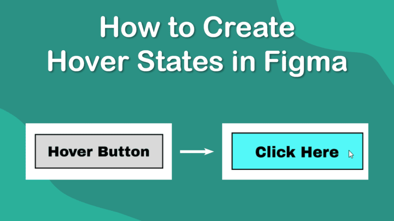
Interactive elements are key for most interface and web design as it shows users how to interact with the elements on the page and let them achieve the desired result. One common interactive element is a hover state, which you can easily create in Figma.
When making a hover state, you can create an interaction that tells a button to change color, or you can make a picture turn gray with a button to click on when a mouse cursor hovers over it. You can create any design for the end result.
I will show you how to make a hover state using a simple button that changes color when the mouse hovers over it, which indicates that users can click it to confirm an action.
Step-by-Step to Create a Hover State in Figma
- Create the Main Element
- Group the Objects Together if Necessary
- Convert the Object to a Component
- Add a Variant to the Component
- Change the Variant Style
- Add a New Interaction
- Adjust the Interaction Settings
- Duplicate the Main Element
- Open the Present Tab
- Test the Button
You can create any object to add a hover state to. You can use images, shapes, and text elements as the main object and the object it changes to after the interaction. When using multiple elements, you can simply group them together to ensure they remain together when moving the elements around and to ensure the interaction works as desired.
Create the Main Element
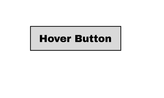
Before you add a hover state, you need to create the main element, which will be visible on the page before a user interacts with it. You should design this how you want the default state to look on the interface or webpage.
I have created a simple rectangle with text inside it.
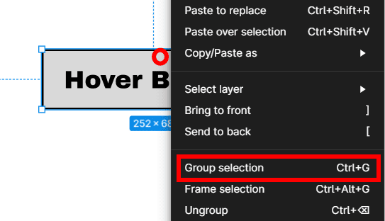
Group the Objects Together if Necessary
If you use multiple objects to create the default element, you can group them together to make managing it easier. Group the objects by clicking and dragging over them all to select them, then right-click and select Group Selection or use the shortcut Control + G on Windows or Command + G on Mac.
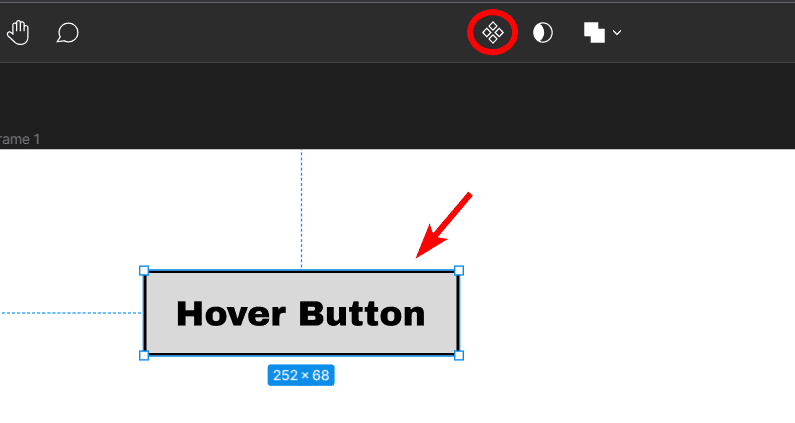
Convert the Object to a Component
Once the elements are grouped, you can convert them to a component, which allows you to add a variant and interactions. To convert the object to a component, select it and click on the Component icon in the top settings bar or use the shortcut Control + Alt + K on Windows or Command + Option + K on Mac.
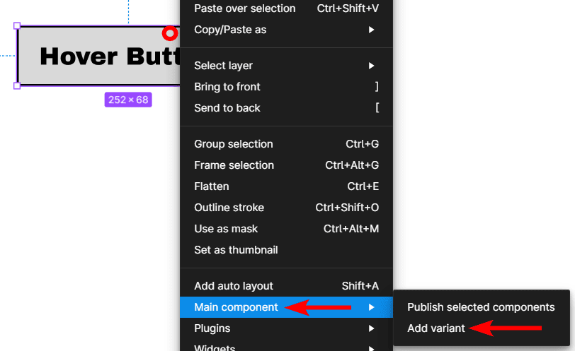
Add a Variant to the Component
Next, add a variant to the component, which will show how you want the element to look when a user hovers over it. Before changing the style, you need to add the variant linked to the original element.
To do this, right-click on the default element and go to Main Component > Add Variant.
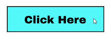
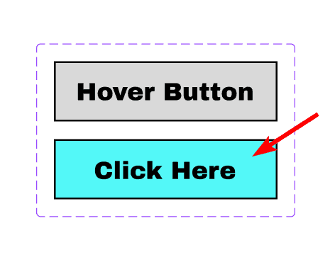
Change the Variant Style
The variant will be added below the original element, and a box with a dotted line will appear around both elements to indicate that they are linked together. The bottom element is the variant, which you can edit to how you want it to appear when someone hovers the mouse over it.
Change the element by double-clicking on the objects and using the Design Panel on the right. I will change the box color and the text.
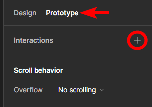
Add a New Interaction
Once you have the default and adjusted design elements connected, you can add a new interaction to set how the first element should change and get to the new element. To add a new interaction, first, ensure the default state element is selected, then open the Prototype Tab in the right-hand panel.
Next, click on the plus sign next to Interactions to add a new interaction.
Adjust the Interaction Settings
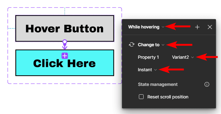
Once you click to add a new interaction, a window opens with different settings to set the interaction to. First, you need to select the action at the top, which you should set to While Hovering.
As you change each setting, more options appear for you to adjust. Next, set the result of the action at the top, which should be Change To.
Underneath the Change To option, you should see your default element, which in my case, is Property 1. Change the second element to what you want the object to change to when hovering, which in my case, is Variant2.
You can then select how you want the element to change, which I set to Instant.
Duplicate the Main Element
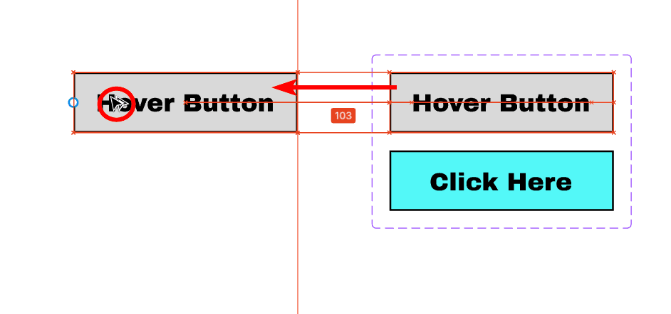
Once you have adjusted the settings, you can click a blank spot on the page to close the settings window. You can also move the components off the visible page out of the way of your design. Now, you can copy the default element and place it where you need it in your design, and it will copy the hover settings with it.
To copy the default element, hold in Alt on Windows or Option on Mac, click on the element, and drag away from it. A copy will appear, and you can place it anywhere.
Open the Present Tab
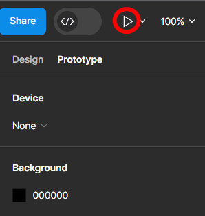
You can now test if the interaction has worked correctly by opening the Present Tab. To open the Present Tab, click on the Present icon at the top right of the interface, which looks like a Play icon.
A new window opens in your browser, showing the design with all the working elements.
Test the Button
You can then simply hover your mouse over the button and see whether it changes as you set it to.