
Breakpoints are an essential element of responsive design in Figma. These points determine where the UI changes its appearance based on the screen width and height, which varies depending on the device used to view a webpage.
There is no dedicated method to create breakpoints in Figma, but there are workarounds and useful plugins to use this feature. Here is how to create breakpoints and the best plugins to use.
Table of Contents
What Are Breakpoints?
Breakpoints are the points at which the UI changes its layout or appearance based on the screen width or height. For example, a website may have a horizontal navigation bar on desktop screens but switch to a vertical sidebar or a hamburger menu on mobile screens. These changes are triggered by breakpoints, which are usually defined by pixel values or device types.
Breakpoints help designers create UIs that are consistent, usable, and accessible across different devices and platforms. They also help developers implement the UIs using CSS media queries or other techniques.
Adding breakpoints is essential to help you plan the layout during the designing phase. To start off, it’s best to incorporate the three main device sizes: Web, mobile, and tablet/iPad.
How to Create Breakpoints in Figma
Figma does not have a built-in feature for creating breakpoints, but it offers several ways to achieve the same effect. Here are some of the methods that you can use to create breakpoints in Figma:
Using plugins: You can use plugins or community files to create breakpoints in Figma. Plugins are extensions to add extra functionality to Figma, such as generating code, creating animations, or testing usability. This is the fastest and most efficient way to create breakpoints.
Using frames and constraints: You can create multiple frames for different screen sizes and use constraints to adjust the size and position of the elements within each frame. Constraints are rules that define how an element behaves when its parent frame is resized. You can set constraints for horizontal and vertical resizing, alignment, and pinning. This method allows you to create responsive layouts that adapt to different screen widths and heights but requires creating and maintaining multiple frames for each screen size.
Using auto layout and variants: You can use auto layout to create flexible layouts that adjust to the content and the container. Auto layout is a feature that allows you to create frames that automatically resize and reposition their children based on padding, spacing, and alignment settings. You can also use variants to create different versions of the same component with different properties, such as size, color, or visibility. This method allows you to create responsive components that adapt to different content and contexts, but it does not allow you to change the overall layout of the UI based on the screen size.
Figma Breakpoints Plugins
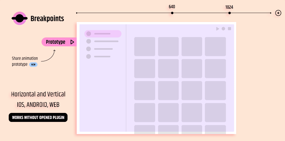
Breakpoints: This plugin allows you to create breakpoints for different screen sizes and devices. You can define the breakpoints by pixel values or device types, and the plugin will create frames for each breakpoint. You can also preview the UI on different devices and export the breakpoints as CSS media queries.
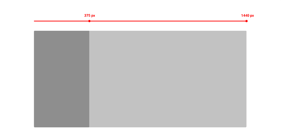
PointBreak: This allows you to add breakpoints, customize the values, and create a horizontal ruler to mark each breakpoint. You can reposition and resize the ruler as needed to easily align elements and create a consistent design across multiple screen sizes.
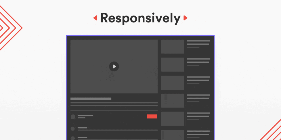
Responsively: This plugin is a quick way to view your design on different screen sizes. As long as you name the layers correctly, the plugin will show you the different views based on the screen sizes for desktop, tablet, and mobile.
Breakpoints are an essential concept for creating responsive UIs in Figma. Figma does not have a native feature for creating breakpoints, but it offers several ways to achieve the same effect, such as using frames and constraints, auto layouts and variants, or plugins and community files. By using these methods, you can create UIs that are consistent, usable, and accessible across different devices and platforms.