
Designing static interfaces is relatively simple in Figma, as you simply need to place the elements on the pages in the layout you want. However, the program becomes more complex when you want to design interactive components, such as buttons that change when you hover over or click on them.
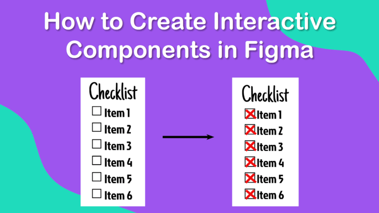
While beginners using Figma may feel overwhelmed when attempting the more complex tasks, I have broken down the process into simple steps below. Once you follow the method below to create an interactive to-do list, you can design your own interactive elements with ease.
You can use any design for the default button or element and for the active element, which is what the object changes to when interacted with. Once you know the basics, you can get creative and design unique interfaces.
Table of Contents
Overview of How to Create Interactive Components in Figma
- Add the default element to the page
- Create a similar element with the new properties
- Set each element to a component
- Combine the elements as variants
- Rename the components to keep everything organized
- Create the default design on the canvas
- Open the Prototype tab
- Connect the two components together
- Set the interaction to On Click
- Set the Action for the components
- Set the Property to the second element you created
- Set the transition type
- Click on the Present button
- Test the interactive element in the Present tab
- Check that the component changes to the correct style and look
Step-by-Step to Creating Interactive Components in Figma
This process can be used on any element you want to change on your website or app. You can simply decide on the default object and what it should change into. Once you convert the objects to components, link them, and set the properties, you will have an interactive element in your layout.
Add the Default Element to the Page
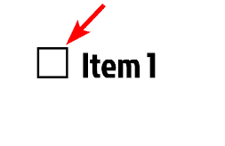
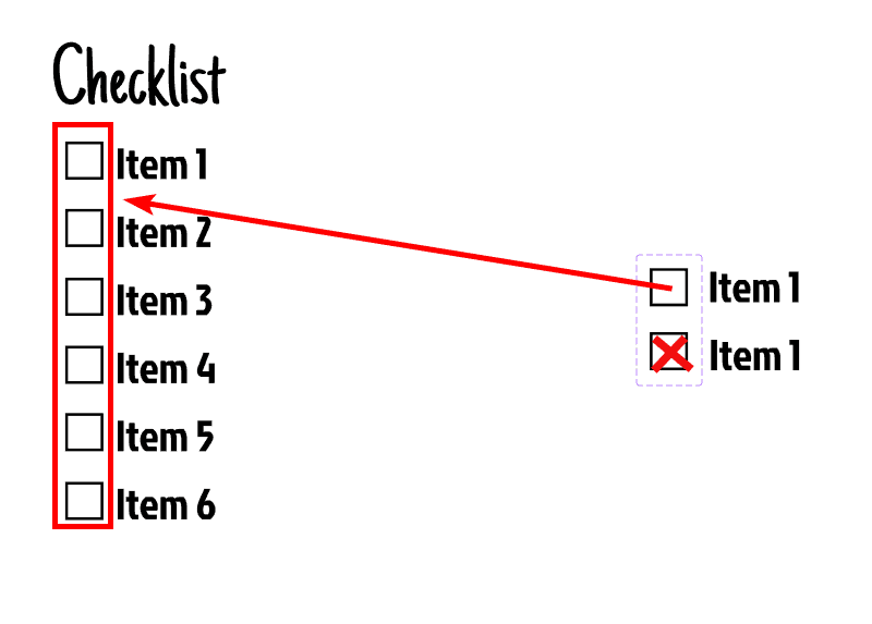
To start, you need to add the default element to your page. This is how the object will look before a user interacts with it, so it can be a button, a checkbox, an image, or anything you can think of.
I want to create a checklist for this example, so I will start by adding an empty box as the default element. This is how the box should look when a user first sees it and hasn’t interacted with it by hovering over it or clicking on it.
Create a Similar Element With the New Properties
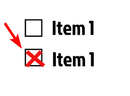
Next, duplicate the default object and then adjust the properties as needed. Usually, you would just need to change the color and a few elements on it and keep the general design similar to the default object. However, the properties of the new object depend entirely on the result you are after in your design.
For my checkbox, I will add a quirky red X in the checkbox and group the elements using Control + G on Windows or Command + G on Mac to show that the item is checked off.
Convert Each Element to a Component
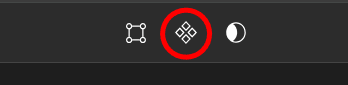
For you to connect the objects, you need to convert them into components. To convert an object into a component, select it and then click on the Create Component icon in the top toolbar. You can also use the shortcut Control + Alt + K on Windows or Command + Option + K on Mac.
Repeat this on both objects individually, be careful not to select the objects together and convert them simultaneously, as this will cause problems in the process.
Combine the Elements as Variants
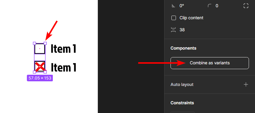
Now that both your objects are components, you can combine them as variants to show that one must change into the other when a user interacts with it.
To combine the elements, first, select both elements by clicking on each one while holding in Shift, or click and drag over both objects. Then, click on the Combine as Variants button, which is located under the Components section in the Properties panel on the right.
Rename the Components to Keep Everything Organized
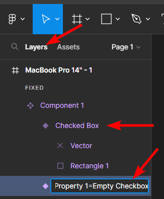
Once you have connected the two components, it’s important to rename them in the Layers Panel on the left. This will ensure that you can keep track of the components and set the interaction correctly.
Rename the component by selecting it on the canvas, then locate it in the Layers Panel (it will be highlighted in the Layers Panel). Double-click on the component name in the panel and then type in the new name for it. Repeat this for the second component as well.
Create the Default Design on the Canvas
You can now create your design that will feature the interactive component on the canvas. Select the first component you created, and copy it by holding in Alt on Windows or Option on Mac and dragging it away from the original. Repeat this process to make as many copies as you need for your design, ensuring that you copy the default component.
Open the Prototype Tab
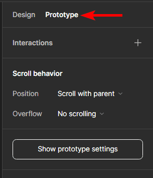
Once your design is ready on the page, you need to connect the two components you initially created to ensure that one component turns into the second when interacted with. To do this, first, open the Prototype tab on the right-hand side.
Connect the Two Components Together
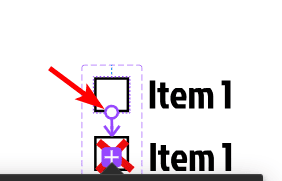
Once the Prototype tab is open, select the default component by double-clicking on it. Once the component is selected, you will see a small plus sign appear on the side of the box when you hover over it. Click the plus sign and drag the line down to the second component until it clips onto it, then let go. The two components will now be connected.
Set the Interaction to On Click
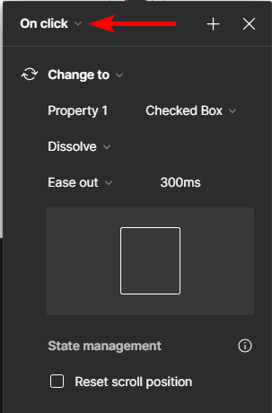
As you drop the connection onto the second component, you will see an arrow connecting the two, and a panel will open, which allows you to adjust the properties of the connection.
First, set the interaction the user must do to make the element change. You can choose On click, On drag, While hovering, and many more. For this example, I will set it to On Click.
Set the Action for the Components
Next, you need to set the action, which determines what happens to the default component when a user interacts with it. In this example, we want the box to change the box with an X in it. You can set your own action, but for this example, I will choose Change to.
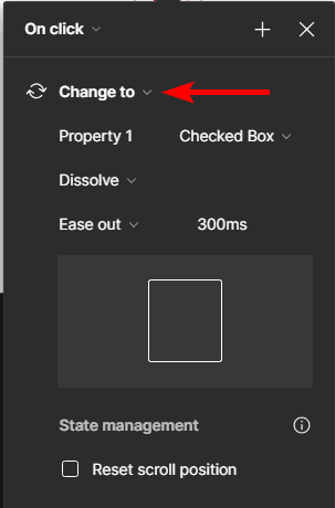
Set the Property to the Second Component You Created
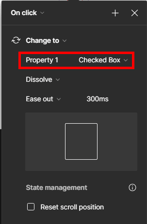
Now, you need to select what the default component will change to, which will usually already be set to the right component. However, you can change this to ensure the default component changes to the right component.
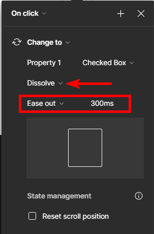
Set the Transition Type
You can also set the transition to adjust how the first object changes to the second, such as by dissolving, moving in, moving out, or any of the other options. I will choose the dissolve option for this example. You can then adjust how the transition functions and the speed of the transition.
Click on the Present Button
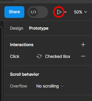
When you are happy with the properties of how the component changes, you can exit the panel using the x icon at the top.
Now, it’s time to check whether the interaction works as you want it to. To check the transition, click on the Present button, which is the Play icon at the top right of the workspace.
Test the Interactive Element in the Present Tab
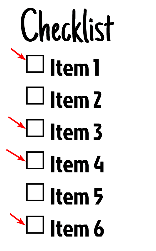
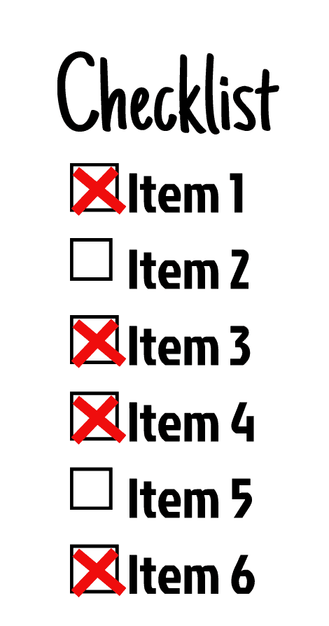
Clicking the Present button causes another tab to open in your browser, which shows a mockup of your design on the template you used, for instance, a cellphone. This allows you to view the design to see how it will actually look on the device. This page also allows you to test any interactions you have created.
Click on the interactive elements to see if they work. I will click on a few of the checklist boxes.
Check That the Component Changes to the Correct Style and Look
Check that the object changed to the second component you designed once you do the set interaction, such as clicking on the boxes in my case. You can now repeat the process to create any interactive components in Figma.
Tools:
- Figma