
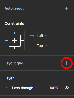
To create layout grids in Figma, select the frame and click on the plus icon next to Layout Grid in the side panel. You will have a default grid added to your design. However, you can take grids a step further by customizing the settings and picking a grid type.
Here is everything you need to know about Figma layout grids and how to use them in your projects.
Table of Contents
What Is A Layout Grid in Figma
Layout grids can be used to align objects or text within a frame or to add a visual element to the design. The grids keep content organized and structured, whether you are simply using the grid as an alignment tool or as a visual element.
Layout grids don’t rely on pixels, so you don’t need to work with specific dimensions or resolutions. The grid can only be added to a frame, whether it is a top-level, nested, or component frame.
As a result, layout grids are helpful to:
- Keep your designs consistent across platforms
- Speed up the process when creating wireframes
- Create diverse layouts, including icons, page layouts, or galleries
Step-by-Step to Create a Layout Grid in Figma
Follow these steps to create a default grid in Figma. You can then follow the next sections to learn how to customize your grid and change between grid styles if necessary.
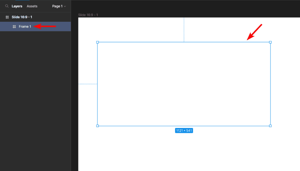
Select Your Frame
First, select your frame on the canvas. You can click on the frame on the canvas or select the frame from the layers panel on the left.
Add a Layout Grid
Next, add a layout grid to the frame by clicking on the plus icon next to Layout Grid in the Design panel.
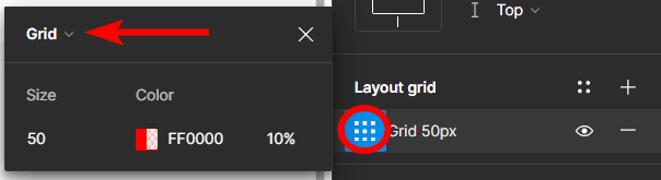
Change The Grid Settings
Once you have added a new layout grid, you can adjust the grid settings by clicking on the grid icon next to the new grid. The next section explains how to work with the grid settings.
Check the Canvas
Once you have adjusted the grid settings as needed, you can click on the canvas to close the settings window, and you will have a layout grid inside your frame.
Add More Grids to the Frame (Optional)
You can also add multiple grids to the frame to create a custom layout grid. To add more grids, simply click the plus icon next to Layout Grid in the Design Panel and adjust the settings as needed.
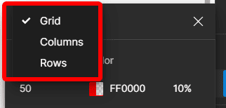
Types of Layout Grids in Figma
There are three types of grids you can use in Figma, which are the Uniform Grid, Columns, and Rows. Each grid offers different properties and settings to adjust to get the perfect grid you need for your design.
To change the grid type, add a new grid and open the settings window using the steps above. In the settings window, click on the drop-down arrow at the top of the window.
Then, choose the grid type you’d like to use.
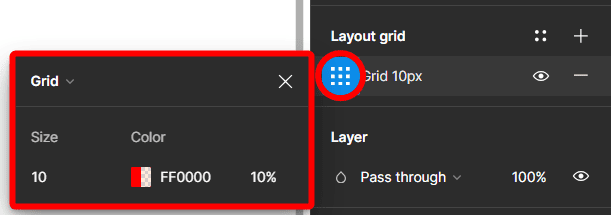
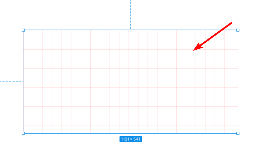
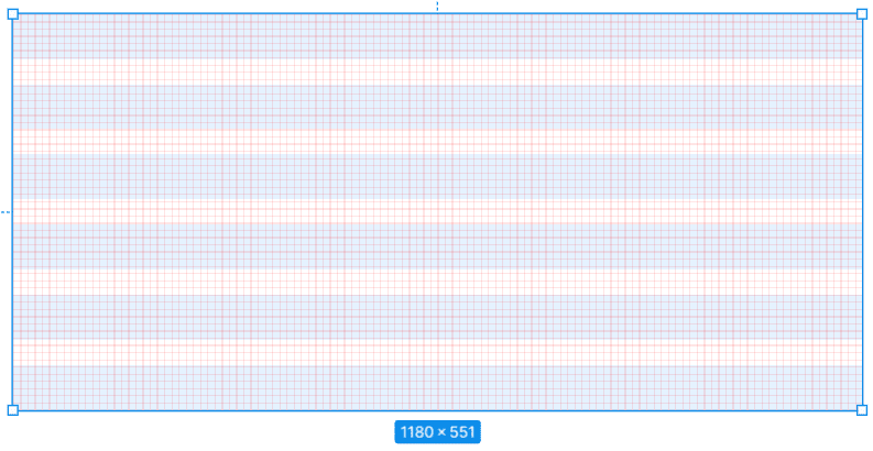
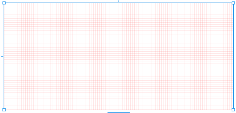
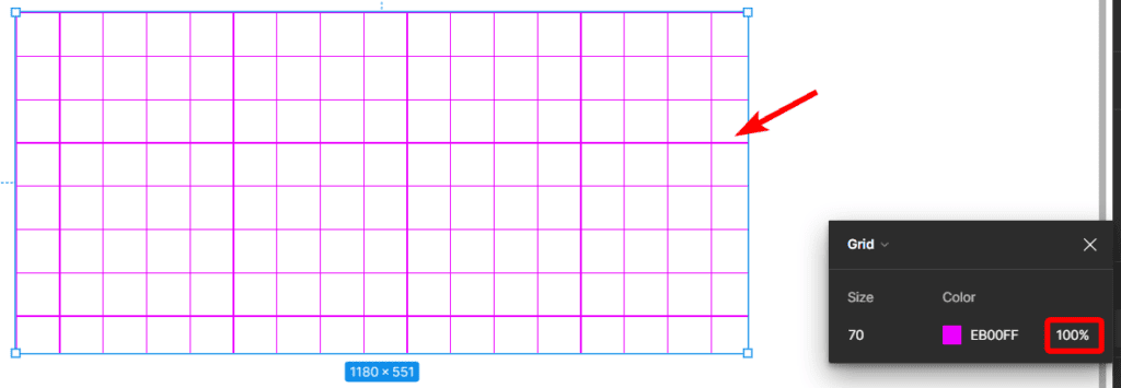
Uniform Grid Properties
The square Uniform Grid is the default style, which creates a layout containing columns and rows. This grid type creates uniformly spaced fields across the frame in a typical grid shape. This grid type is useful when needing to space out elements across the frame using both horizontal and vertical guidelines.
There are a few settings you can adjust when using a Uniform Grid. First, you can change the Size of the grid, which determines how small or large the fields are within the grid.
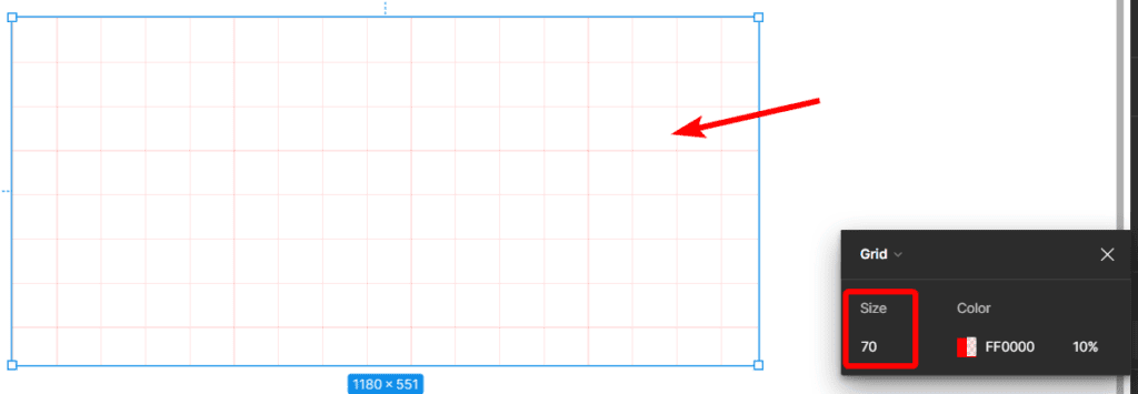
Then, you can adjust the Color of the grid. You can set a color for the lines and leave the fields transparent or choose two colors.
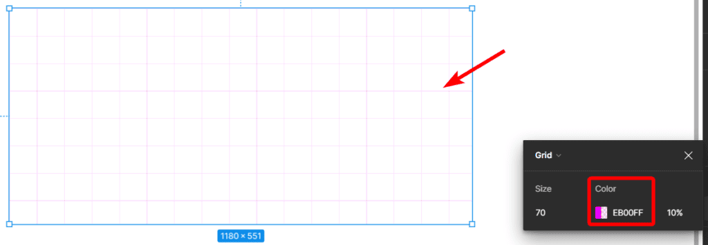
Lastly, you can adjust the Opacity of the color. This setting determines how light or dark the color of your grid is.
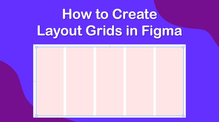
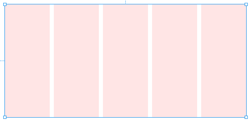
Column Grid Properties
The next type of grid is the Columns grid, which offers only vertical grid lines to work with. This is a helpful tool when you are working with web design elements to help you align and distribute elements across the page. There are more settings to adjust when working with column grids.
First, you can adjust the Count, which determines how many columns are spread out across your frame. You can select a number up to 12 from the drop-down menu or add a custom amount of columns for your frame.
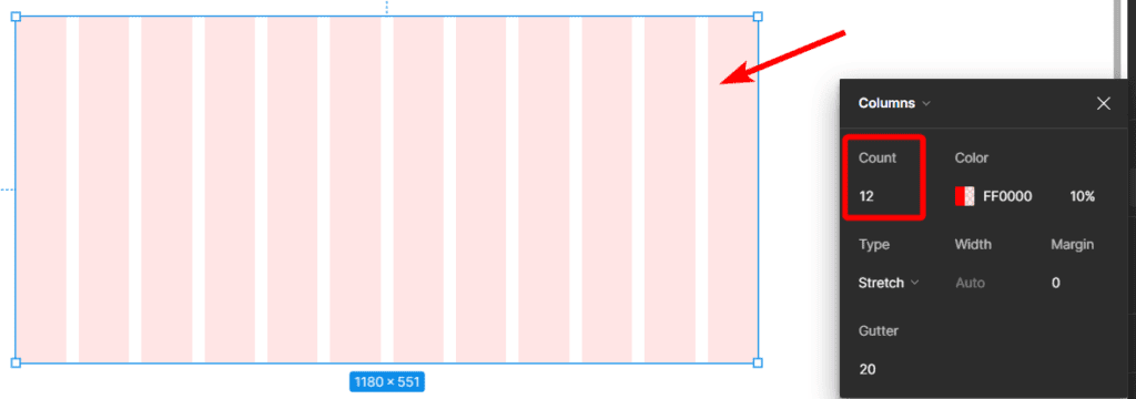
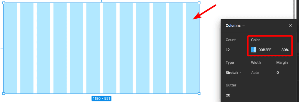
Then, as with the Uniform Grid, you can also change the Color and the Opacity of the color for the grid.
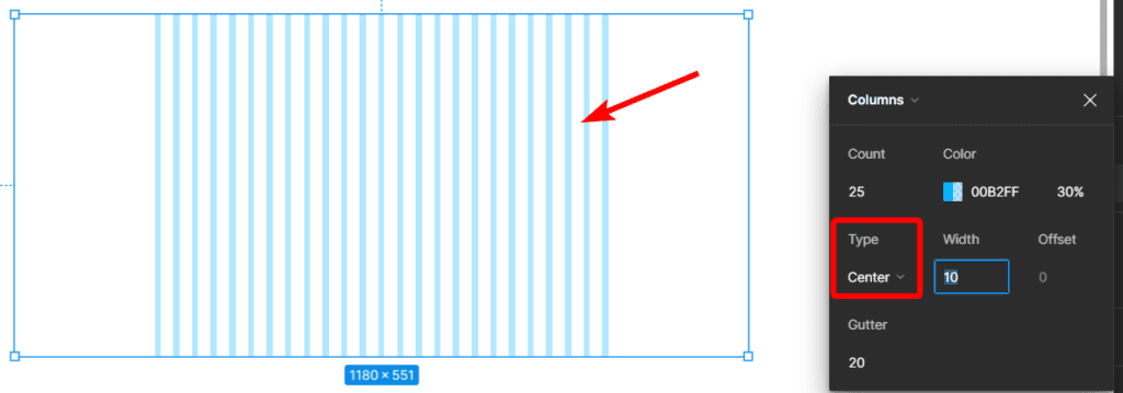
You can then adjust the Column Grid Type and choose between Left, Right, Center, or Stretch. The first three options, which are known as a fixed grid, align the columns to that side of the frame so the columns will start from the left or the right of the frame or be placed in the center.
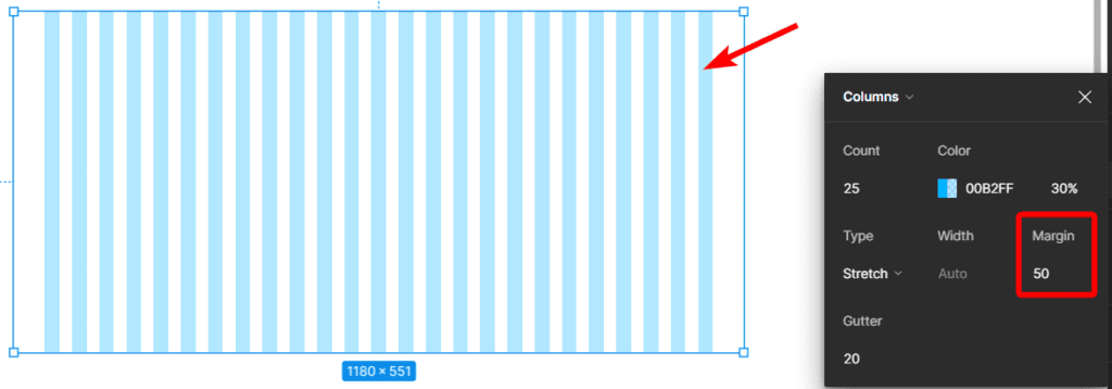
Then, Stretch, known as a flexible grid, allows the grid to be responsive as the columns are stretched across the frame to fit the entire frame and can be stretched or contracted when the frame is resized.
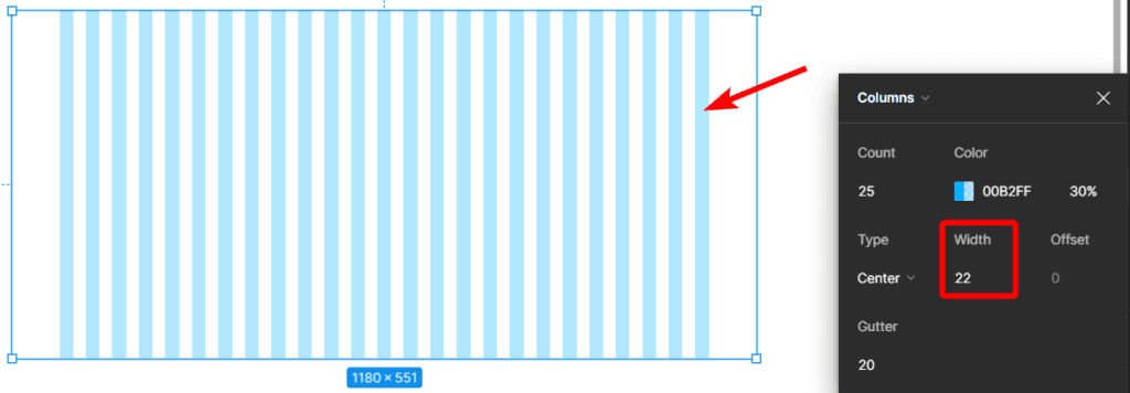
If you use any of the options apart from Stretch, you can then set a specific Width size for the columns using the Width setting.
If you select the Stretch option, you can set a custom Margin for the left and right of the frame. This allows you to leave a set space open on either side of the grid, which won’t change even if the frame is resized.
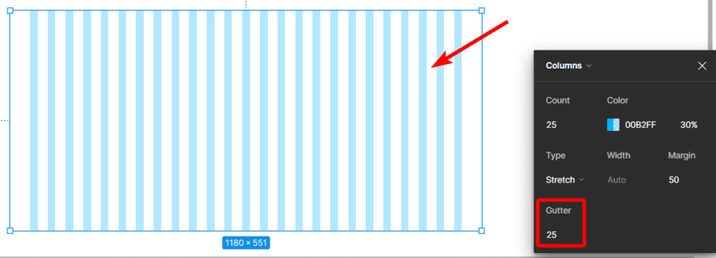
Lastly, you can use the Gutter option to set the middle space between the columns, which will, in turn, affect the column size based on the other settings you’ve used.
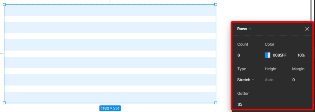
Row Grid Properties
The last Grid type is the Rows Grid, which is similar to the Column grid, except you have only horizontal rows inside the frame, which is best used for aligning typography elements inside the frame.
The settings for the Rows grid are the same as the Column grid, except for all the horizontal elements.
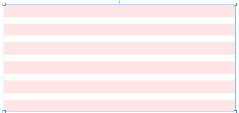
You can follow the settings for the Column Grid type section above to understand these settings.
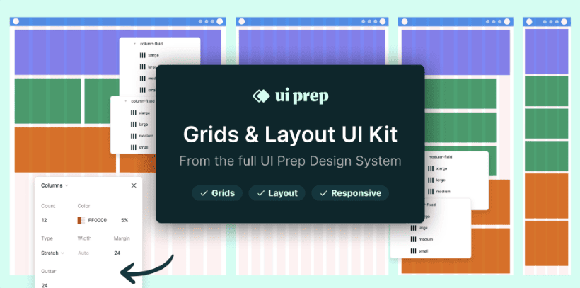
Bonus UI Responsive Layout Grid Plugin
In most cases, you would want to create a grid you can customize fully to get the exact grid you need for your project. However, there are many benefits to using a grid plugin, which will optimize your workflow.
This Grids and Layout UI kit, developed by Molly Hellmuth, offers you the perfect kit for beginners to get straight into working with grids. There are fixed and flexible grid elements as well as breakpoints, which create responsive designs for various devices and screen sizes.